UI customization
Learn how to customize the mobile SDK UI to blend seamlessly into your app.
The mobile SDK comes with two default themes:
- Light theme
- Dark theme
To switch between these themes, pass a DojoThemeSettings object as a parameter when starting a payment flow.
- Swift
- Objective-C
ui-customization.swift
// Obtain an instance of the desired theme
var lightTheme = DojoThemeSettings.getLightTheme()
let darkTheme = DojoThemeSettings.getDarkTheme()

// Set an individual property to a custom color
lightTheme.primaryLabelTextColor = .red

// Pass the desired theme to the SDK when starting the payment flow
let dojoUI = DojoSDKDropInUI()
dojoUI.startPaymentFlow(themeSettings: darkTheme)
ui-customization.m
// Obtain an instance of the desired theme
DojoThemeSettings *lightTheme = [DojoThemeSettings getLightTheme];
DojoThemeSettings *darkTheme = [DojoThemeSettings getDarkTheme];

// Set an individual property to a custom color
lightTheme.primaryLabelTextColor = [UIColor red];

// Pass the desired theme to the SDK when starting the payment flow
DojoSDKDropInUI *dojoUI = [[DojoSDKDropInUI alloc] init];
[dojoUI startPaymentFlowWithPaymentIntentId:@"<paymentIntentId>" themeSettings:darkTheme];
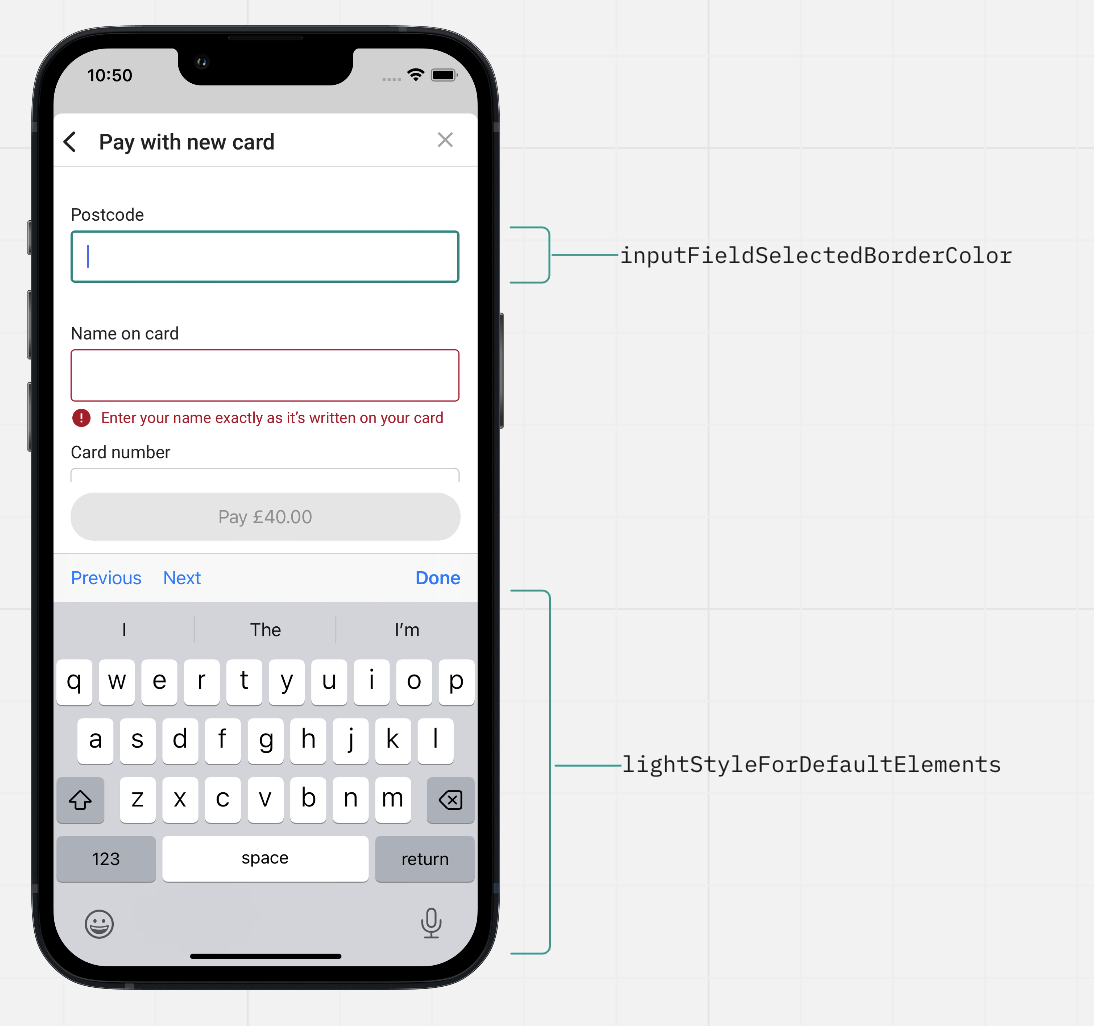
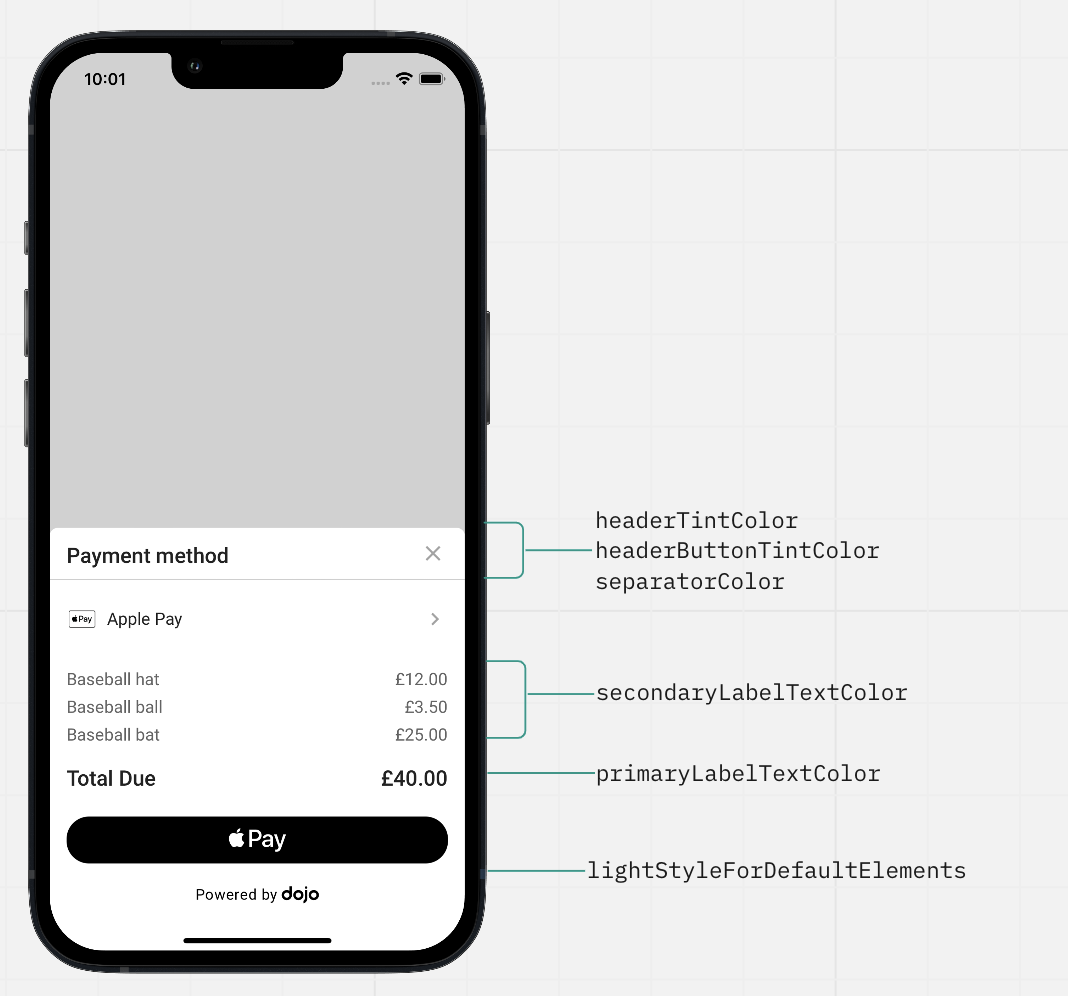
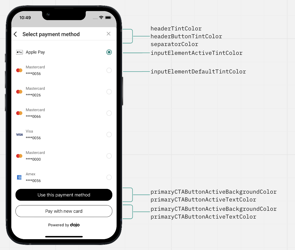
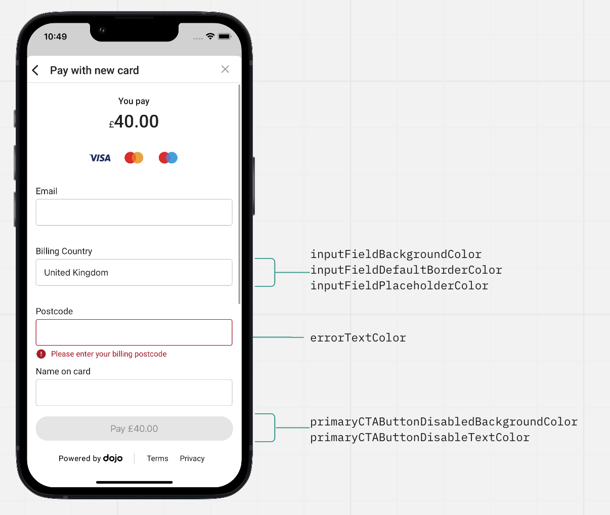
Properties
DojoThemeSettings contains multiple properties that you can set individually.
| Property | Description |
|---|---|
primaryLabelTextColor | Primary label color. |
secondaryLabelTextColor | Secondary label color. |
headerTintColor | Header text color. |
headerButtonTintColor | Color of header buttons like the X button. |
primarySurfaceBackgroundColor | Background color of the screen. |
primaryCTAButtonActiveBackgroundColor | Background color of primary button. |
primaryCTAButtonActiveTextColor | Font color of primary button. |
primaryCTAButtonDisabledBackgroundColor | Background color of disabled state of primary button (filled button). |
primaryCTAButtonDisableTextColor | Font color of disabled state of primary button. |
secondaryCTAButtonActiveBorderColor | Border color of the secondary button (button that's transparent and only has a border color). The background color is the same as current primarySurfaceBackgroundColor and can’t be changed. |
secondaryCTAButtonActiveTextColor | Font color of secondary button. |
separatorColor | Color of separator between header and the screen content. |
errorTextColor | Error message color. |
loadingIndicatorColor | Color of the animated loader on the initial loading screen. |
inputFieldPlaceholderColor | Input field placeholder color. |
inputFieldBackgroundColor | Input field background color. |
inputFieldDefaultBorderColor | Input field default border color when field isn't selected and not in the error state. |
inputFieldSelectedBorderColor | Input field border color when selected. |
inputElementActiveTintColor | Color of tick boxes and saved card selection circle when selected. |
inputElementDefaultTintColor | Color of tick boxes and saved card selection circle when not selected. |
lightStyleForDefaultElements | Switch between light and dark sets of graphic elements (like keypad, Apple Pay, card schema images). |
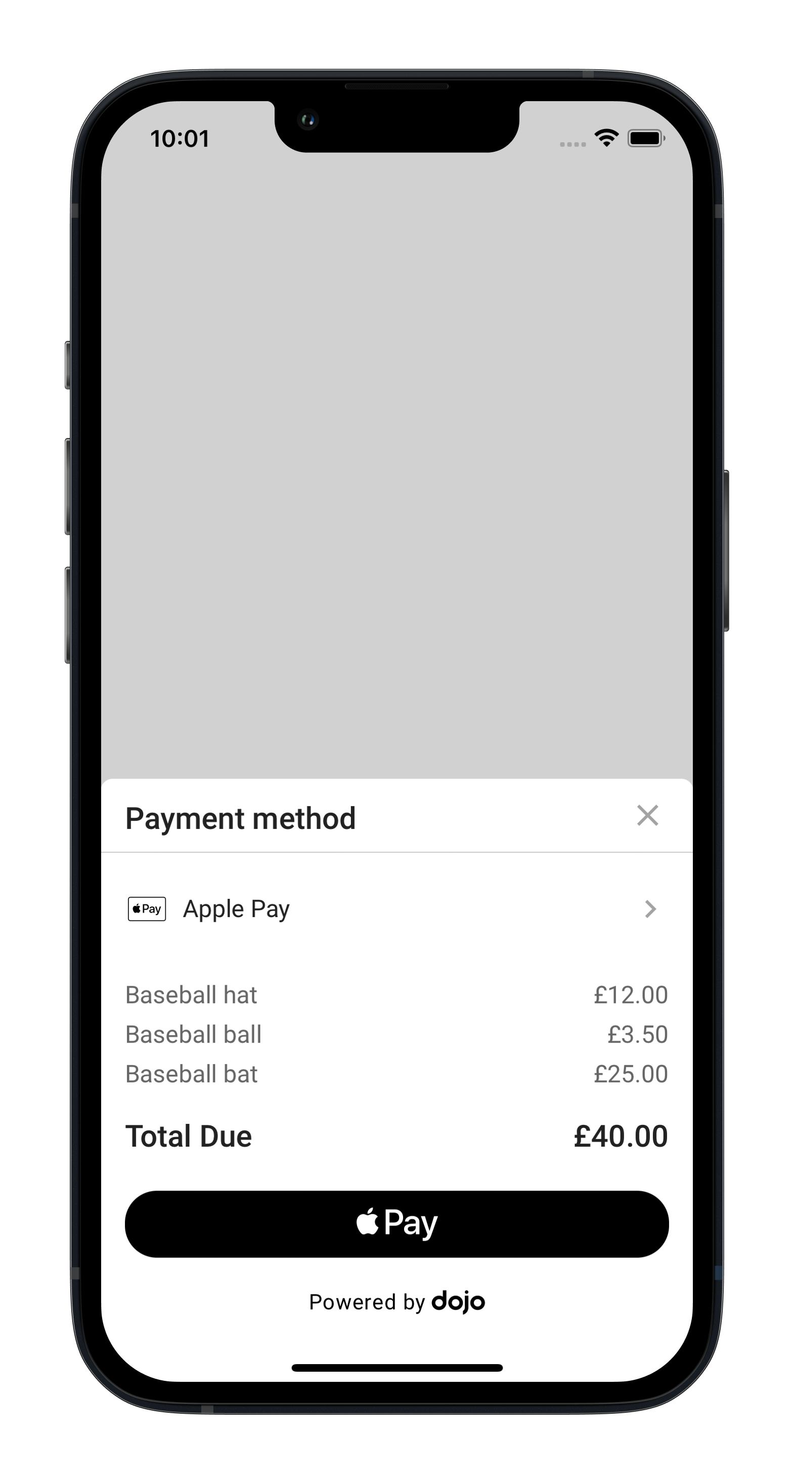
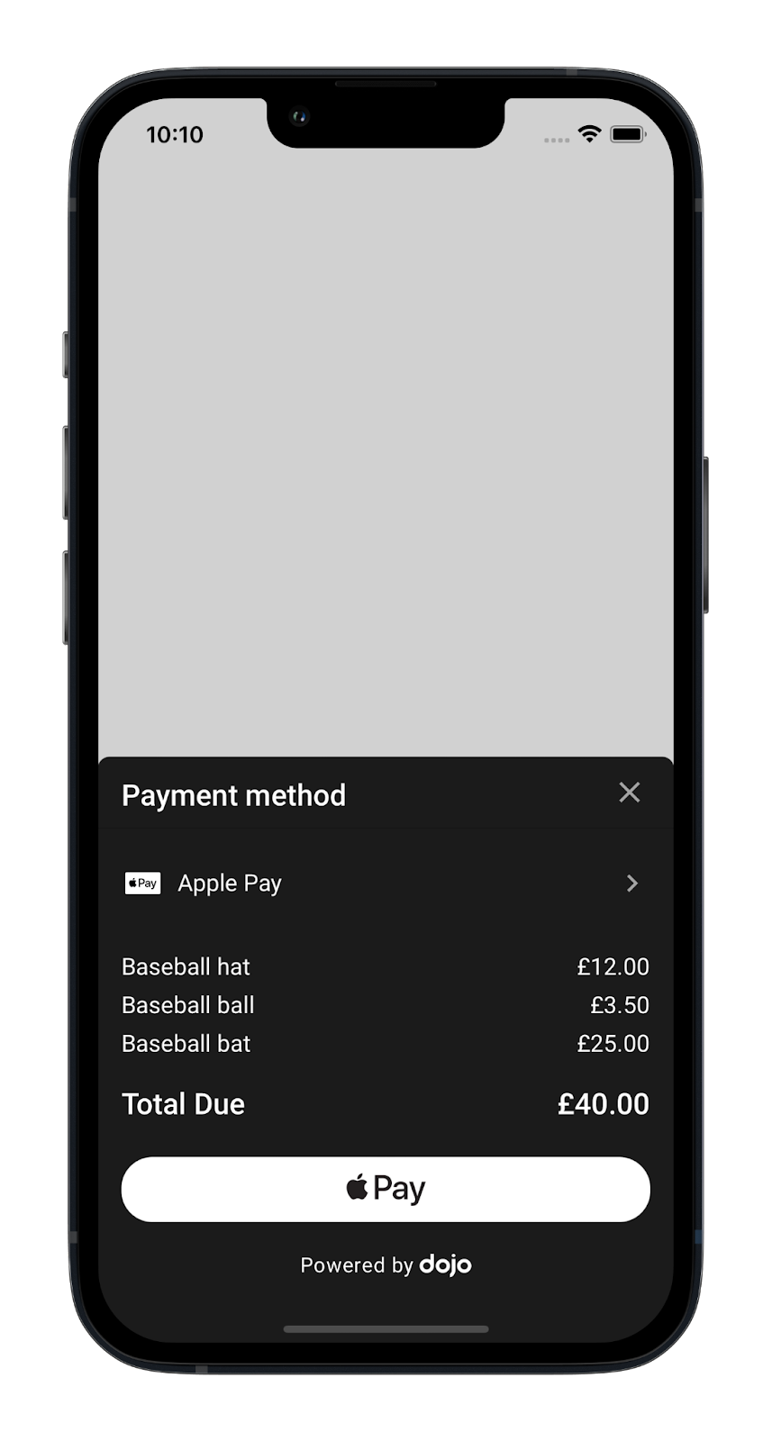
Illustrations
The following images are illustrations of the items available for customization.
Screen 1: Apple Pay
Screen 2: Saved card
Screen 3: Input name, address, and email
Screen 4: Input screen with keypad