UI customization
Learn how to customize the mobile SDK UI to blend seamlessly into your app.
The mobile SDK comes with two default themes:
- Light theme
- Dark theme
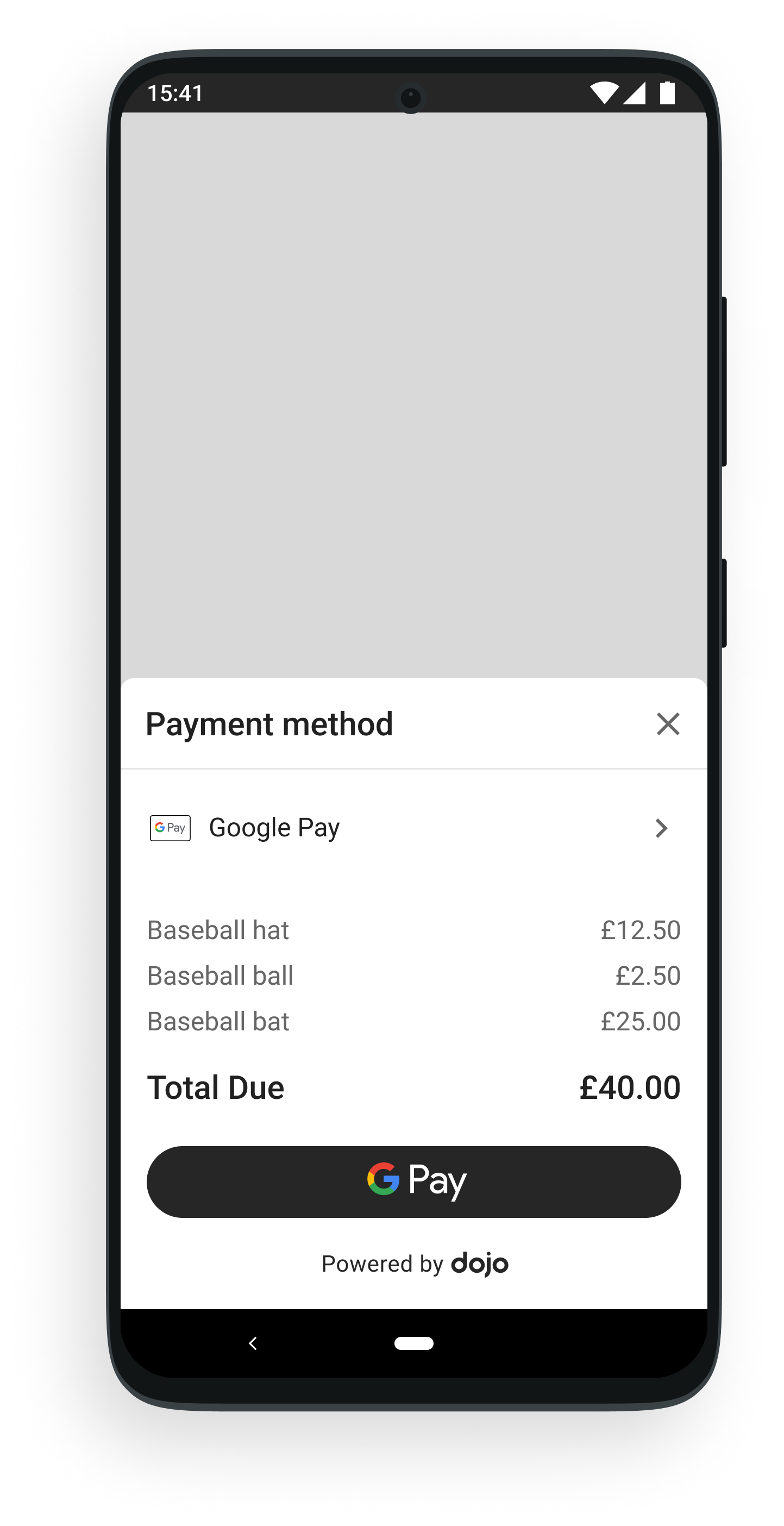
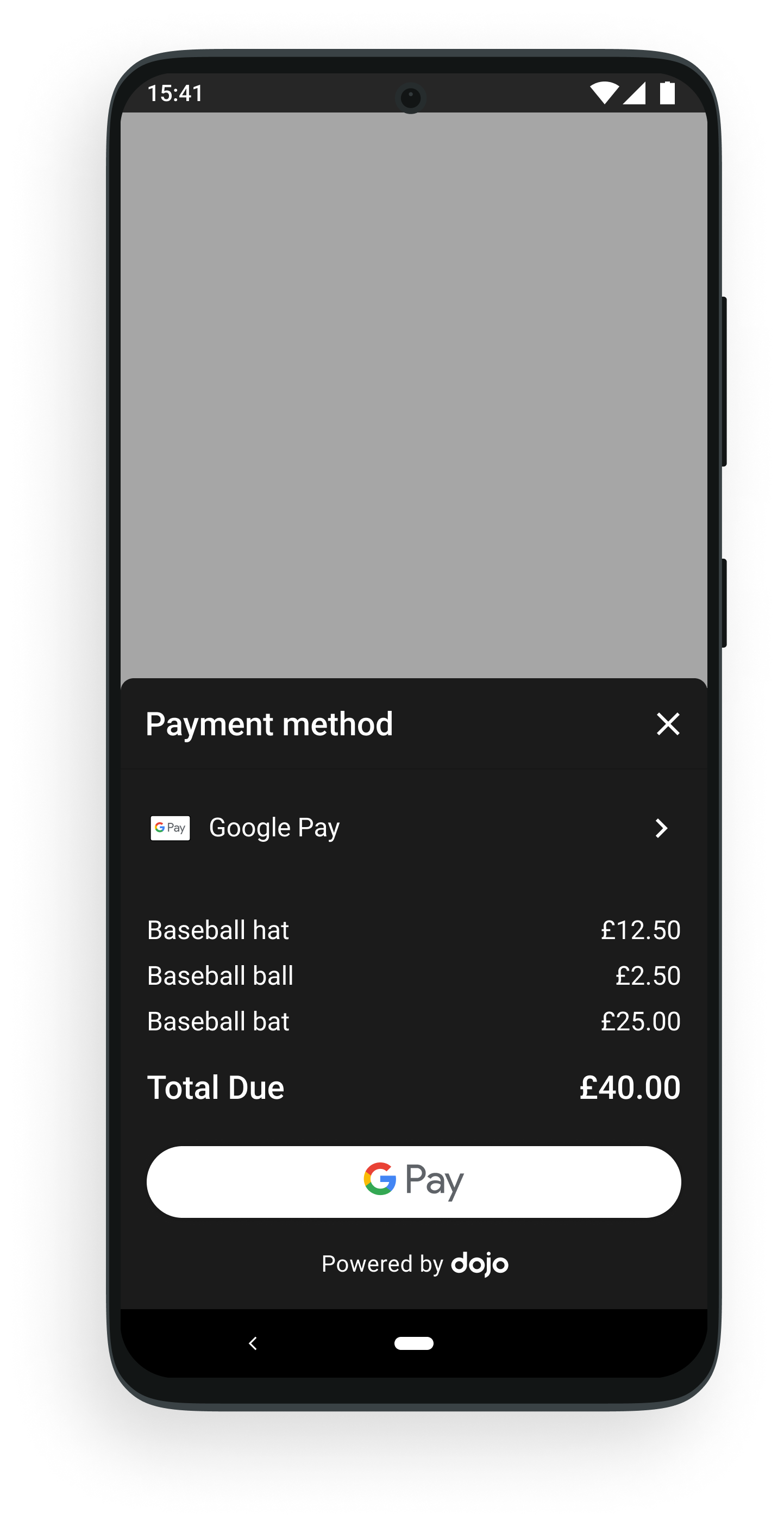
To switch between these themes, pass a DojoThemeSettings object as a parameter when starting the payment flow.
- Kotlin
- Java
ui-customization.kts
// call this before you display the UI SDK on the screen
private fun configureDojoThemeSettings() {
    val lightColorPalette =
        LightColorPalette(
            // you can override any property value to `lightColorPalette`
            primaryLabelTextColor = "#DD000000"
        )
    val darkColorPalette =
        DarkColorPalette(
            // you can override any property value to `darkColorPalette`
            primaryLabelTextColor = "#FFFFFFFF"
        )
    DojoSDKDropInUI.dojoThemeSettings =
        DojoThemeSettings(
            lightColorPalette = lightColorPalette,
            DarkColorPalette = darkColorPalette,
            // set to true if you don't support dark mode
            forceLightMode = false,
            // set to false if you want to hide Dojo branding
            showBranding = true
        )
}
ui-customization.java
// call this before u display the ui sdk on the screen
private void configureDojoThemeSettings() {
        // you can override any value you for lightColorPalette
        LightColorPalette lightColorPalette = new LightColorPalette(
            "#DD000000" // primaryLabelTextColor
         );

        // you can override any value for the darkColorPalette
        DarkColorPalette darkColorPalette = new DarkColorPalette(
            "#DD000000" // primaryLabelTextColor
        );

        DojoThemeSettings dojoThemeSettings = new DojoThemeSettings(
            lightColorPalette,
            darkColorPalette,
            // set that one to true if you don't support dark mode
            false,
            // set that one to false if you want to hide dojo brand
            true
        );
        DojoSDKDropInUI.INSTANCE.setDojoThemeSettings(dojoThemeSettings);
    }
Properties
DojoThemeSettings contains multiple properties that you can set individually.
| Property | Description |
|---|---|
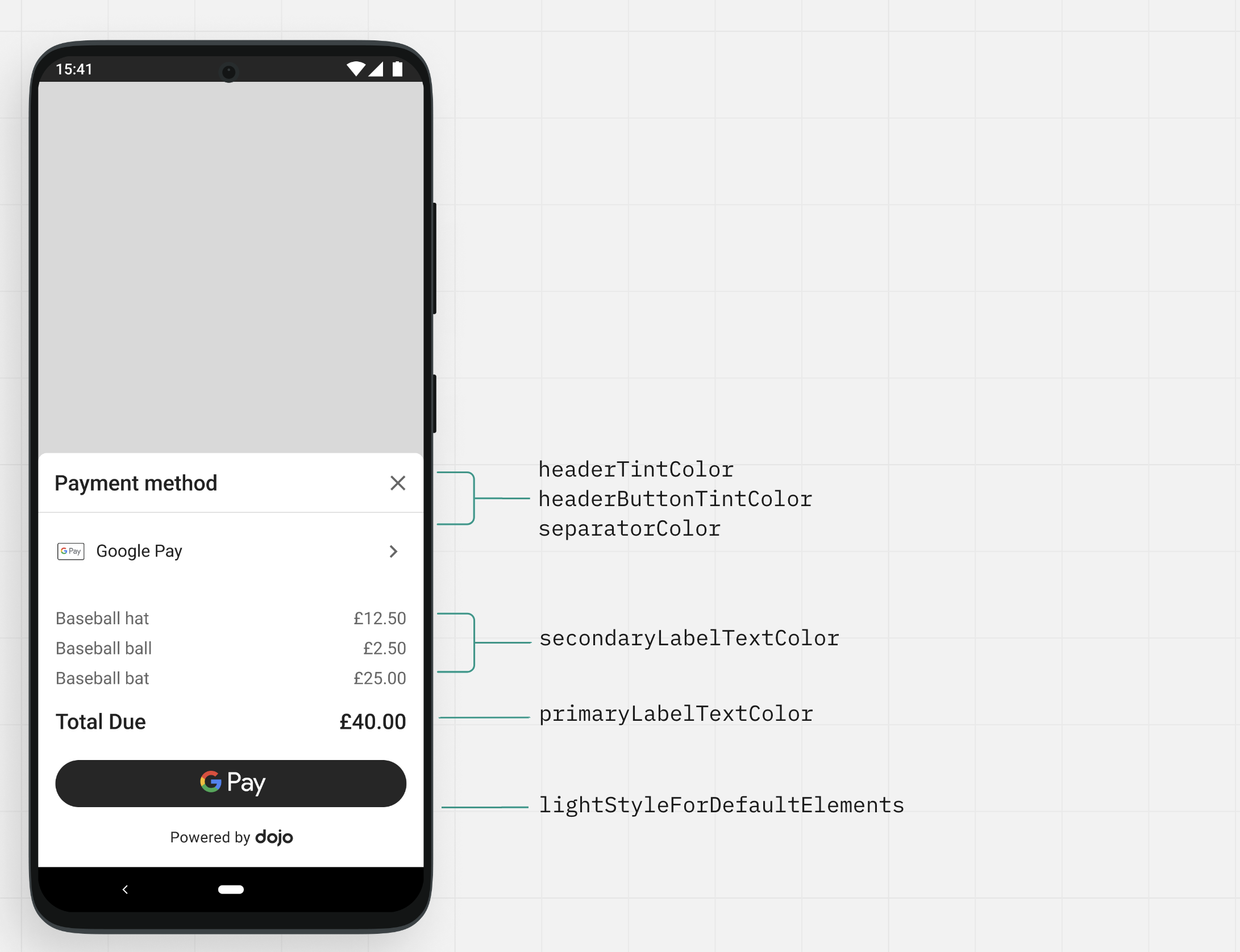
primaryLabelTextColor | Primary label color. |
secondaryLabelTextColor | Secondary label color. |
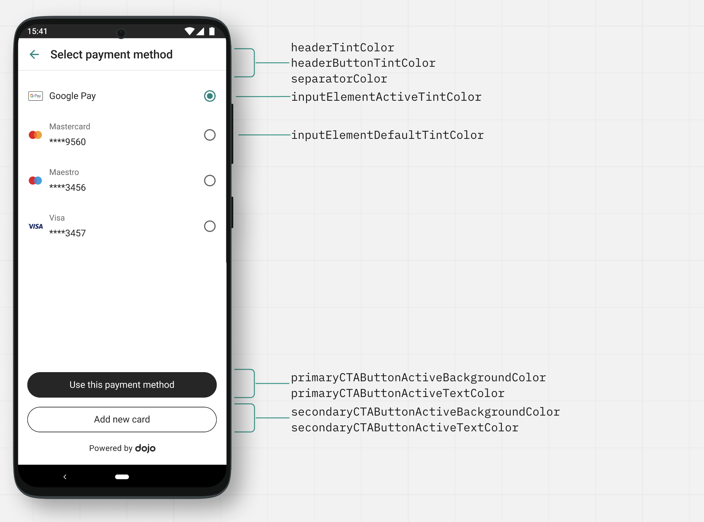
headerTintColor | Header text color. |
headerButtonTintColor | Color of header buttons like the X button. |
primarySurfaceBackgroundColor | Background color of the screen. |
primaryCTAButtonActiveBackgroundColor | Background color of primary button. |
primaryCTAButtonActiveTextColor | Font color of primary button. |
primaryCTAButtonDisabledBackgroundColor | Background color of disabled state of primary button (filled button). |
primaryCTAButtonDisableTextColor | Font color of disabled state of primary button. |
secondaryCTAButtonActiveBorderColor | Border color of the secondary button (button that's transparent and only has a border color). The background color is the same as current primarySurfaceBackgroundColor and can’t be changed. |
secondaryCTAButtonActiveTextColor | Font color of secondary button. |
separatorColor | Color of separator between header and the screen content. |
errorTextColor | Error message color. |
loadingIndicatorColor | Color of the animated loader on the initial loading screen. |
inputFieldPlaceholderColor | Input field placeholder color. |
inputFieldBackgroundColor | Input field background color. |
inputFieldDefaultBorderColor | Input field default border color when field isn't selected and not in the error state. |
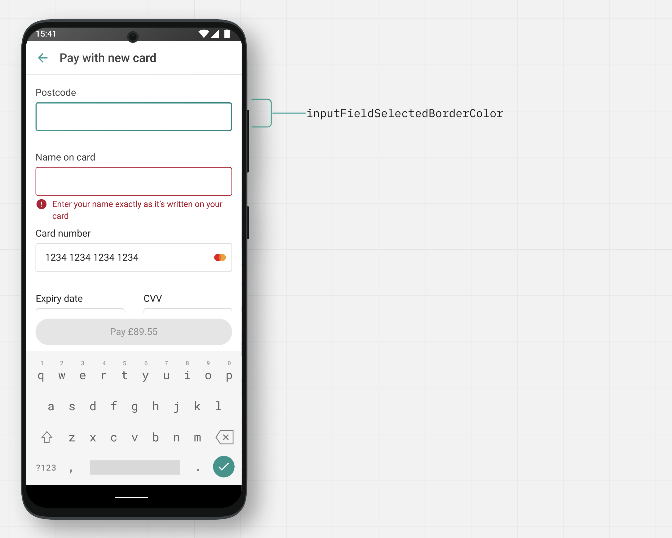
inputFieldSelectedBorderColor | Input field border color when selected. |
inputElementActiveTintColor | Color of tick boxes and saved card selection circle when selected. |
inputElementDefaultTintColor | Color of tick boxes and saved card selection circle when not selected. |
Illustrations
The following images are illustrations of the items available for customization.
Screen 1: Google Pay
Screen 2: Saved card
Screen 3: Input name, address, and email id
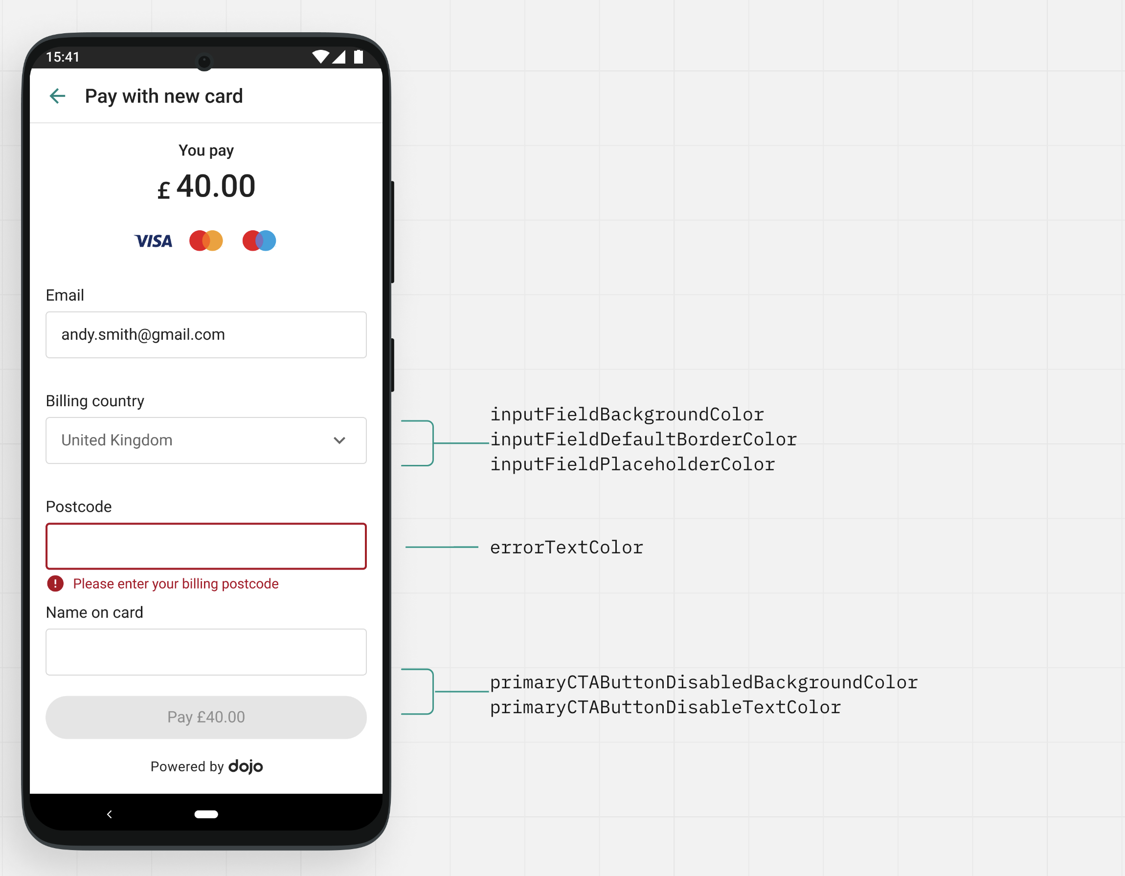
Screen 4: Input screen with keypad